Momentum Brand Identity & Website
Reducing friction in the class booking experience for a cycling studio
Role
Lead Designer (Brand, UX/UI)
Timeline
August 2025
Team
Solo project
Skills
Brand design User research Prototyping
Overview
Momentum Cycle Club is a fictional indoor cycling studio and community brand originally developed as a branding exercise. To evolve the identity into a functional digital product, I designed a responsive, mobile-first website focused on helping users discover and book cycling classes with minimal friction.
This case study explores how I translated brand values into a usable booking experience by streamlining seat selection, class filtering, and confirmation flows, addressing common pain points found in existing fitness booking platforms.

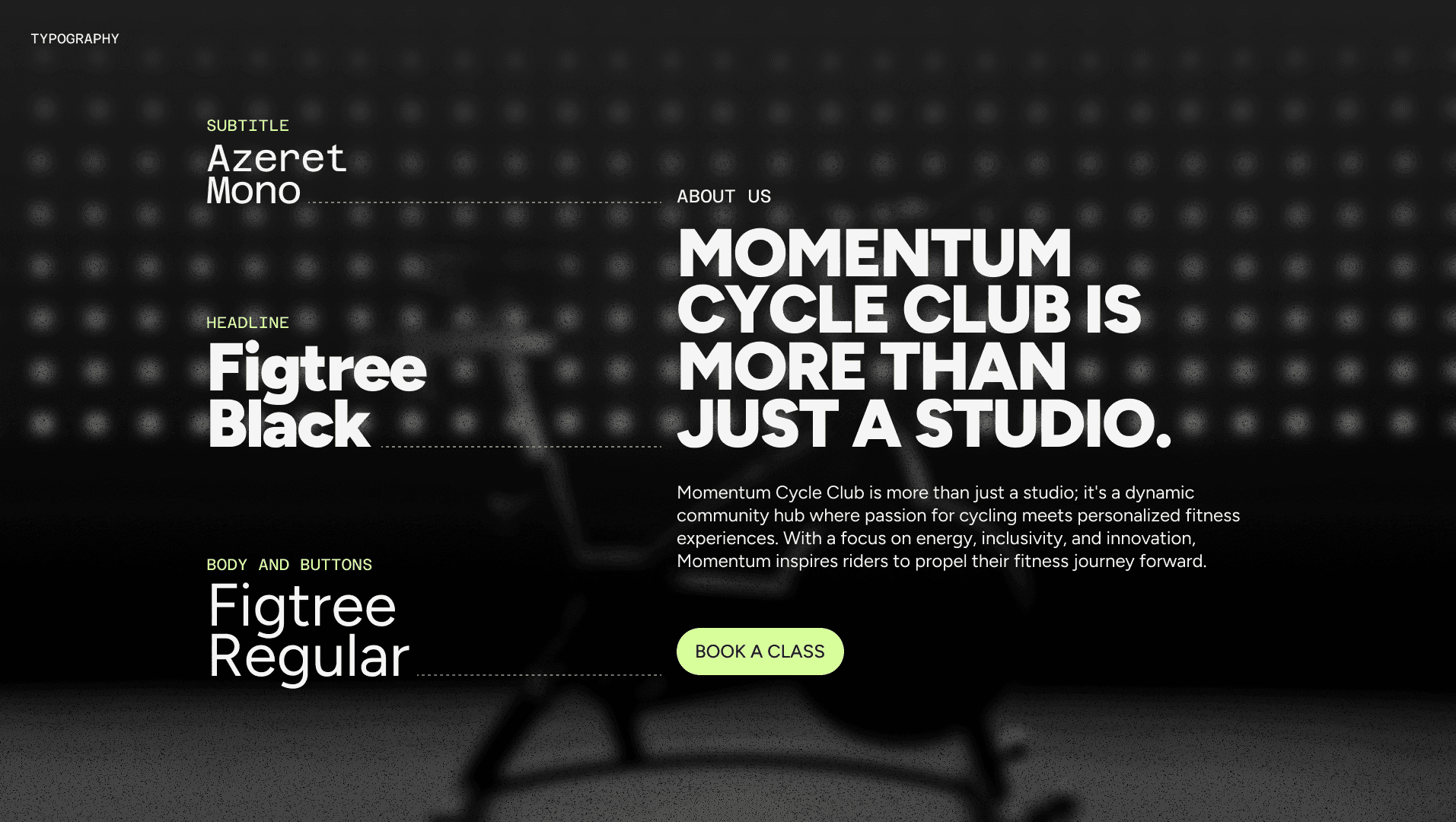
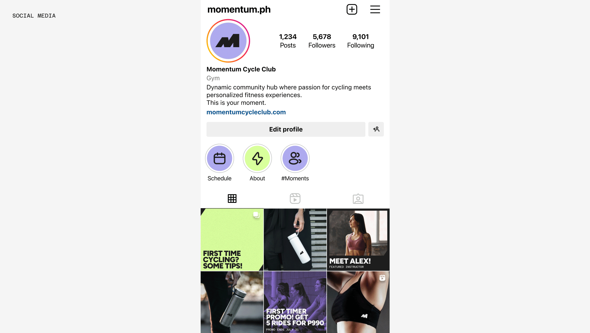
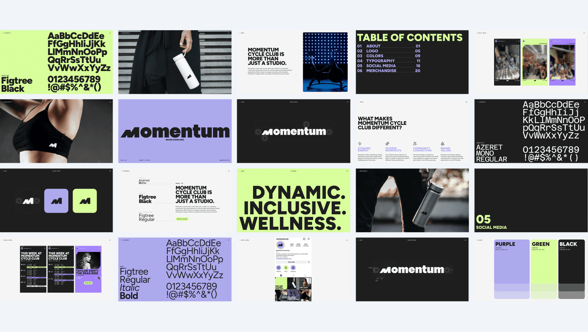
Early brand system developed during the initial Momentum identity exercise.
Browse. Tap. Book.
How might we help busy fitness enthusiasts quickly browse, compare, and book classes through a seamless, low-friction experience?
The solution centers on a simple three-step flow:
Find a class
Choose your seat
Confirm in seconds
The experience is mobile-first, component-driven, and designed for speed, reducing cognitive load while reinforcing confidence at every step.
Understanding Friction in Existing Booking Experiences
To ground the design in real user behavior, I surveyed individuals aged 25–30 who regularly book indoor cycling classes with studios such as Ride Revolution, Electric Studio, and Saddle Row. The research aimed to uncover booking frustrations, decision drivers, and expectations around flexibility and clarity.
Synthesizing survey responses and usability feedback, I mapped a typical user journey across discovery, browsing, booking, and confirmation stages. This surfaced recurring friction points and opportunities for design intervention.

User journey highlights summarizing key pain points and design opportunities.
Challenge 1: Mobile booking feels cramped and overwhelming.
How might we make mobile browsing feel lightweight and approachable?
I designed a mobile-first layout using scrollable class cards, strong visual hierarchy, and generous spacing. Large tap targets and subtle interactions allow users to compare classes quickly without feeling visually overloaded.
Mobile homepage designed for quick class discovery and browsing.
Challenge 2: Schedules are hard to scan and interpret.
How might we help users quickly assess availability and fit?
Class schedules were reimagined as a clean, filterable system that highlights time, instructor, and availability at a glance. Visual tags reduce reliance on dense text, enabling faster decision-making.
Desktop schedule view with filters applied to refine class selection.
Mobile schedule view showing filter interactions in a compact layout.
Challenge 3: Instructor transparency influences booking decisions.
How might we help users feel confident choosing the right class and instructor?
Instructor profiles include short bios, style descriptors, and playlist previews to give users a sense of class energy before booking. A “Featured Classes of the Week” section on the homepage encourages intentional discovery and showcases variety.
Class detail page revealing instructor profile and class context.
Featured Classes section on desktop, supporting guided discovery.
Challenge 4: Fear of losing a spot discourages changes.
How might we help users feel confident when modifying a booking and knowing it was successful?
Design a change booking flow that lets users preview availability before confirming changes, paired with a clear confirmation screen that reinforces success and next steps.
Desktop booking flow showing seat selection and change booking.
Mobile booking flow showing seat selection and change booking.
Test, Learn, Adjust
I conducted asynchronous usability testing with both mobile and desktop users. Participants completed tasks such as filtering classes, selecting seats, confirming bookings, and modifying reservations.
Key insights:
📱 Mobile users needed stronger visual separation between days in the schedule.
🖥️ Desktop users preferred navigation controls over infinite scroll in Featured Classes.
🔄 Users across devices wanted a reset filters option and clearer color contrast for class types.
These findings directly informed layout refinements, interaction patterns, and system-level improvements.
Designing Systems That Work
This project marked a shift from visual execution to systems-oriented UX thinking. Beyond aesthetics, I focused on structure, logic, and scalability.
Key learnings:
🧩 I strengthened my ability to build and document a scalable design system, using text styles, color tokens, and component variants that anticipate real-world use.
📝 I gained experience running asynchronous usability tests, writing task-based surveys, and translating qualitative feedback into concrete design decisions.
👩💻 I saw how small interface details, like color elevation, filter logic, or seat numbering, can impact clarity and user confidence.
Overall, this project helped bridge my background in graphic design with UX research and interaction design, reinforcing my ability to create experiences that are not only polished, but purposeful.

Mar Leaño
Brand and UX Designer
About
I’m Mar, a Manila-based brand and UX designer creating visual systems and digital experiences that combine strategic thinking with expressive design, grounded in research and built for real people.