Cosmos Coffee Brand Identity
Designing a calm, intentional brand identity for a specialty coffee experience

Role
Brand Designer
Timeline
May – June 2023
Team
Mar Leaño Kel Yuki
Skills
Brand identity Visual design Typography
Overview
Cosmos Coffee is a specialty coffee shop in San Juan, Metro Manila, offering a holistic and intentional coffee experience. The brand approaches coffee as more than just a drink, but a moment of presence.
This project focused on translating that philosophy into a visual identity that feels calm and refined, while remaining distinct within a saturated café landscape.
The Challenge
How might we design a coffee brand that feels calm and intentional, while still standing out?
The goal was to balance restraint with recognizability, creating a system that feels quiet and minimal, yet memorable across physical touchpoints.
Design Direction
The visual identity pairs minimalist design with moments of visual interest. Generous negative space and clean typography create a sense of calm, while strong contrasting colors introduce clarity and distinction.
This balance allows the brand to feel both refined and visually engaging without overwhelming the experience.
Identity Details
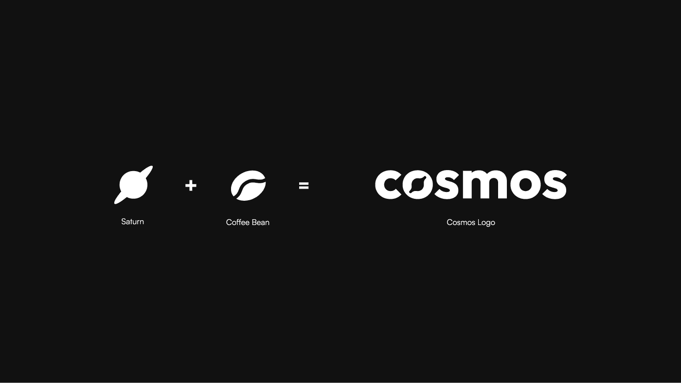
The wordmark features a geometric sans serif typeface with a custom “o” that subtly resembles both Saturn and a coffee bean, grounding the brand in both its name and product.
This small detail ties into Cosmos’ larger narrative: thoughtfully crafted experiences, from the smallest element to the bigger picture.
Visual System
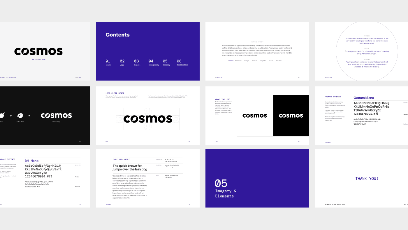
The identity was designed to be flexible across applications, from packaging to in-store materials, while maintaining a consistent tone.
Key elements include:
Minimal typographic logo with refined spacing
High-contrast color pairings for visibility
Structured layouts that emphasize balance and clarity
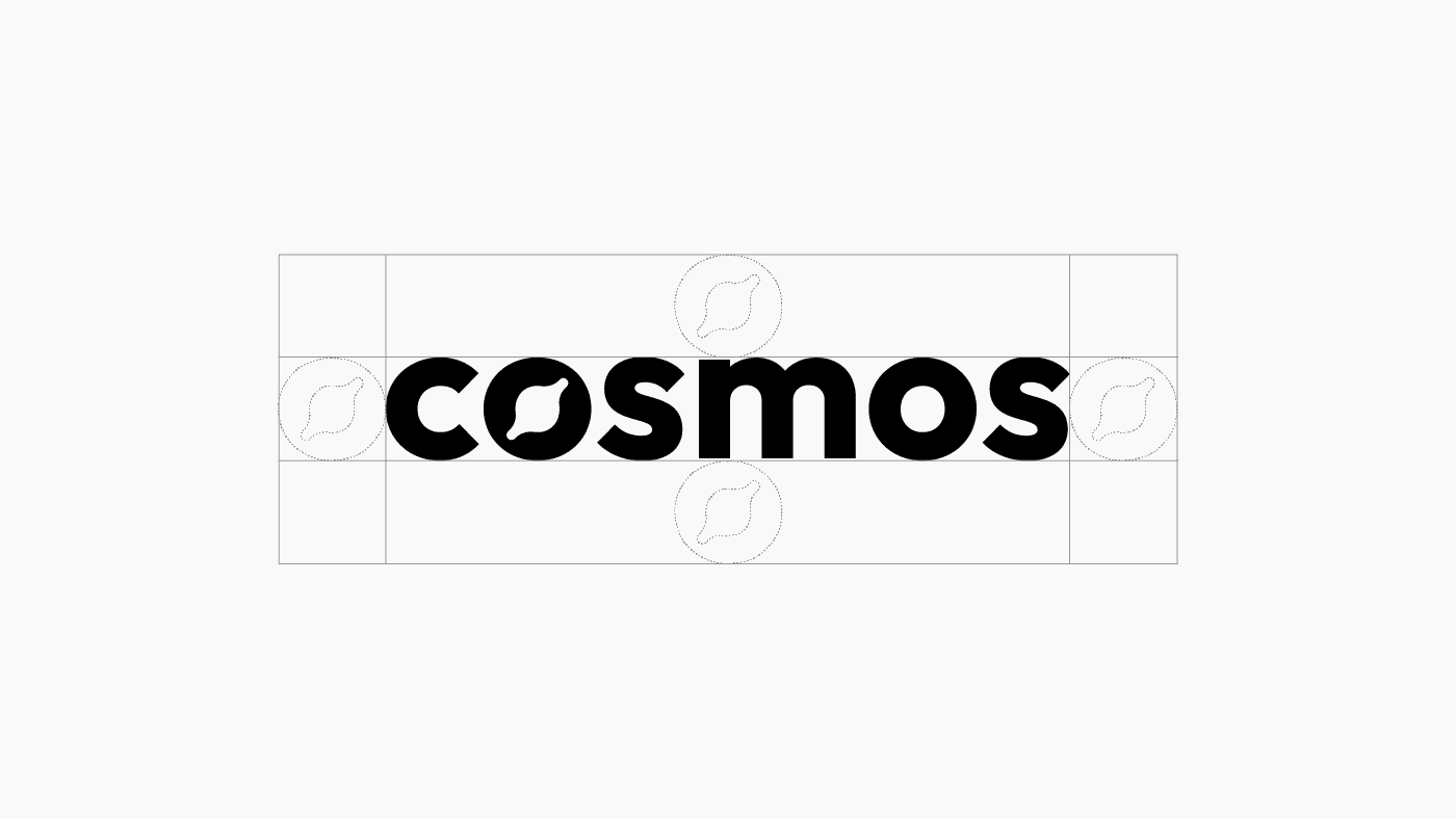
Brand identity system showing typography, color contrast, and layout applications.
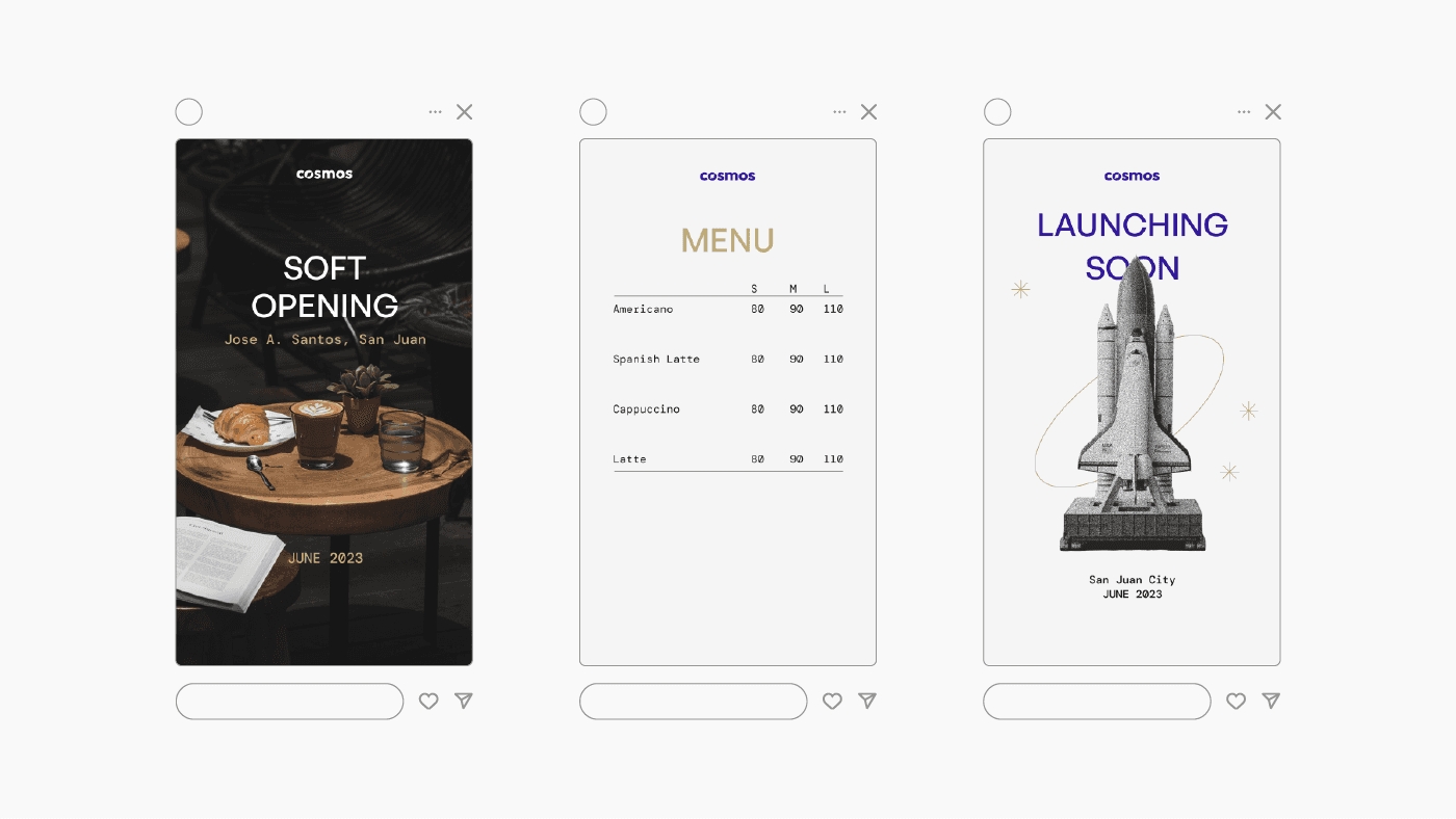
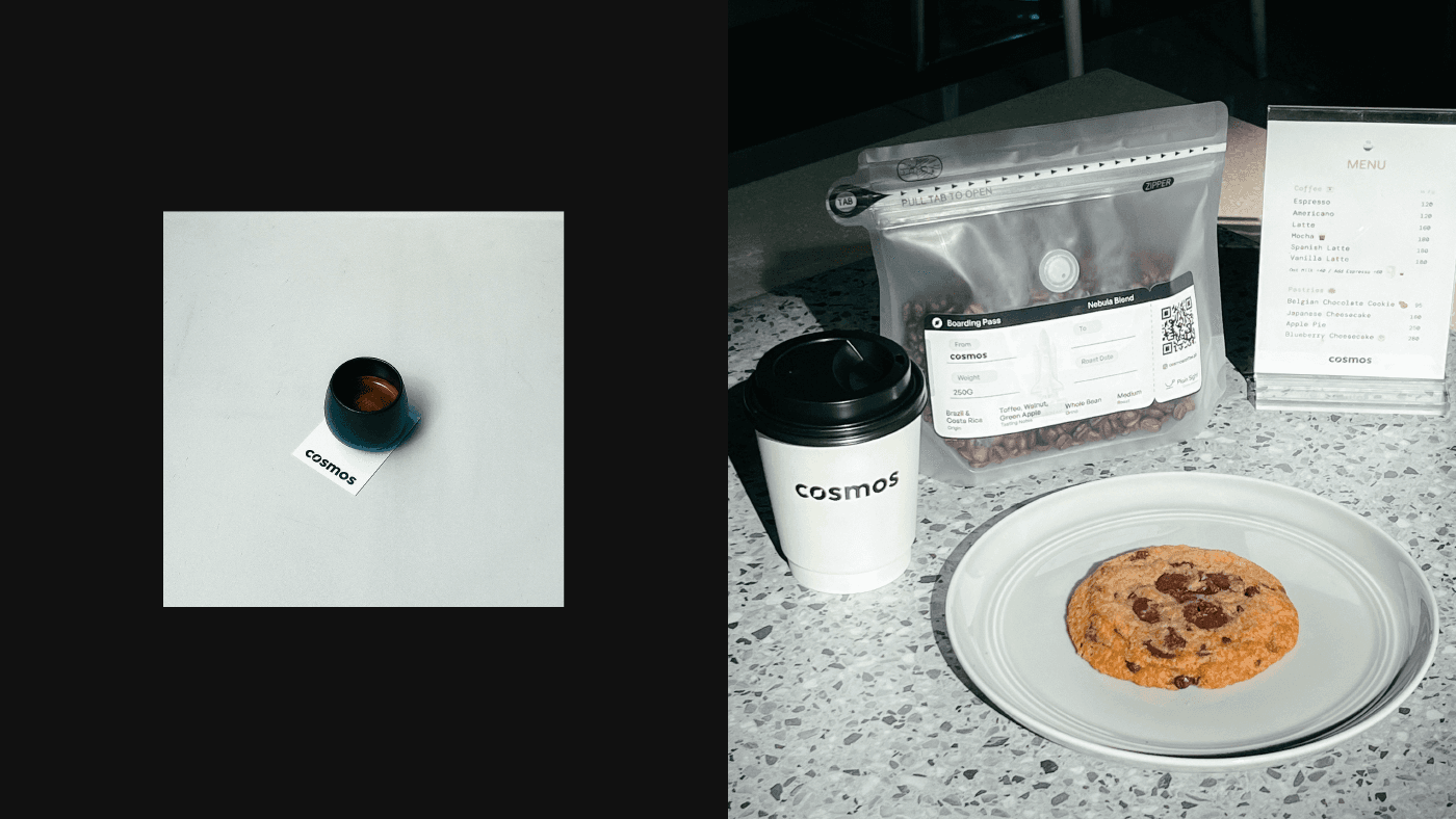
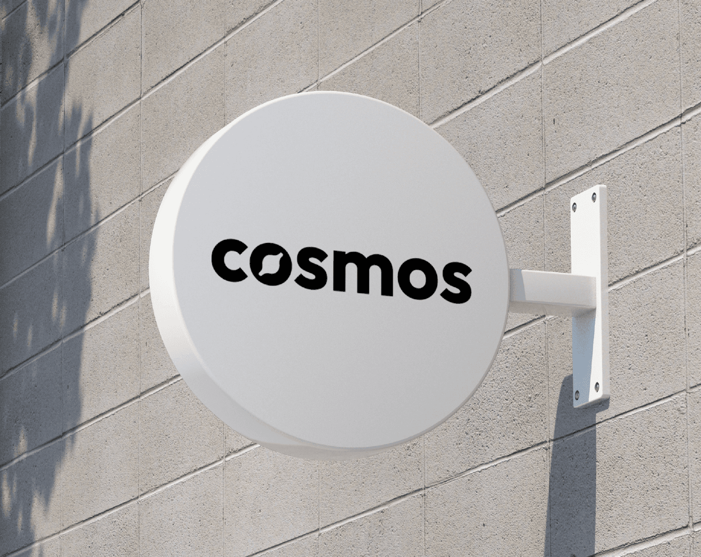
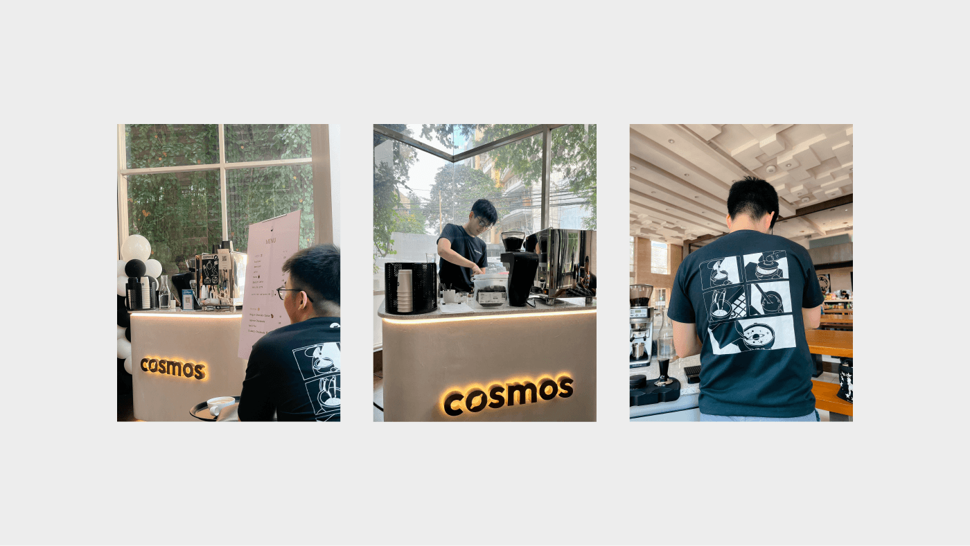
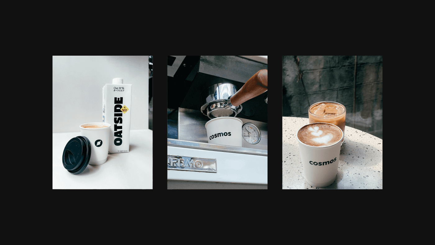
Assorted brand applications including packaging, menu layouts, and signage.
Outcome & Reflection
This project reinforced how restraint and detail can work together, using minimal elements to create a brand that feels both calm and memorable.
It also strengthened my approach to building identity systems that carry a clear concept across multiple touchpoints.

Mar Leaño
Brand and UX Designer
About
I’m Mar, a Manila-based brand and UX designer creating visual systems and digital experiences that combine strategic thinking with expressive design, grounded in research and built for real people.